vallikannu

Logo

Vallikannu Natarajan

Enhancing the experience for health insurance
application re-platform

casestudy_header banner
A health care and well-being company decided to redesign the health insurance web application which was
on a legacy framework. The challenge was to understand the current state pain area and work towards
designing the individual pages aligning to revised user journey and industry best practise.

My Role

As a lead experience designer, collaborated closely with the stakeholder to capture their requirement and
insights. From evaluating the existing application and analysing the research findings to capture the usage
pattern, user journey, challenges and proposed a design solutions to validate with actual users. Conducted
moderated remote user testing. Although I was the sole designer, collaborated with development team for
a seamless implementation.

Problem Space

Since it was a legacy application, it’s essential to understand what works well and what doesn’t to help
modernisation approach. User interviews and observation studies were used to identify these.

Following are the research insights:

  1. The application exhibited redundancies and lacked organisation, making it time consuming to complete
    a task.
  2. Switching between mouse and keyboards controls disrupted the employees workflow.
  3. Employees faced long loading time while switching between different sections and other external
    application to collect data.

The Challenges

User acceptance: It was hard to get users accept and integrate the new system interface into their
everyday routine.
Employee training: Users had to be trained to get familiar with the new infrastructure to have a better experience.

Existing Process

existing process

Our Users

The agents primarily use this application for underwriting and enrolment. Here is a snapshot of their goals and needs.

Usability Analysis

Along with my team we reviewed the old interface for experience problems, here is the brief.

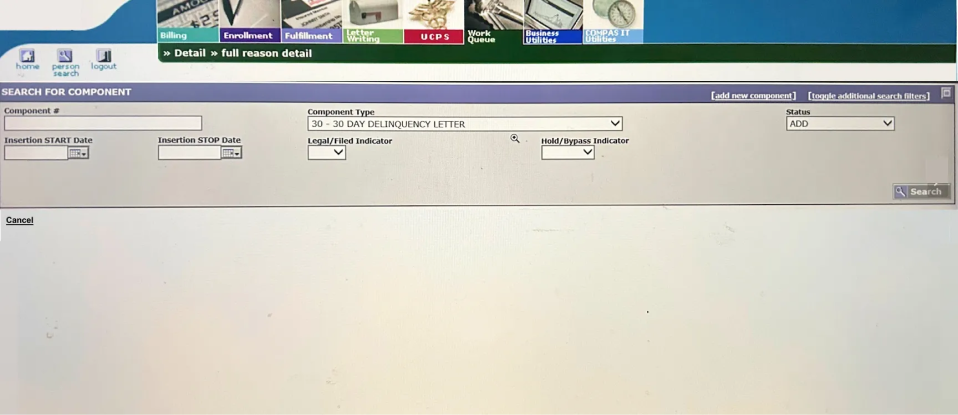
In the above search screen the buttons are placed on both the sides, the button and link style are not
consistent. Users find it difficult to scan through the application, visual alignment is missing. Keyboard
focus order shifts frequently and user has to put in effort while using a keyboard.
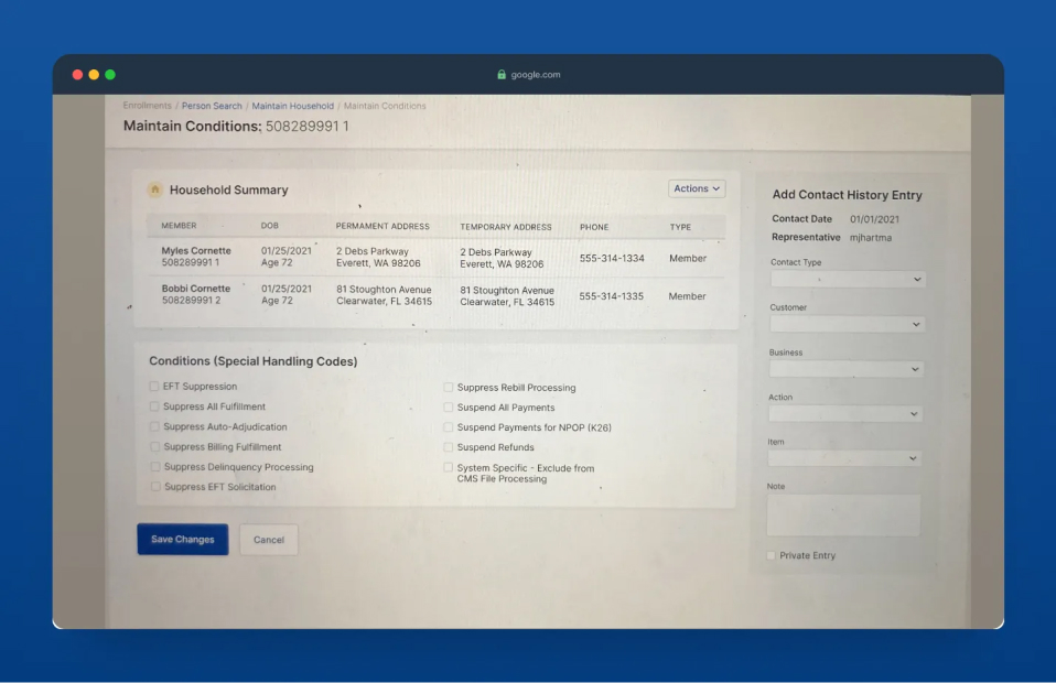
In the above modify screen the UI components are not consistent and adds additional cognitive load for
users. Cannot clear multiple selected items at once.

The Solution

I came up with a solution that mimicked the existing application. Collaborated with client and developers to draw up a solution strategy. This was our proposed user flow for each section, which enabled/empowered the users to be efficient.

  • Created a closed card sorting to revisit the information architecture and categorize the information that matches with user expectation.

  • Providing emphasis on common links, standardising buttons for common actions when possible and putting less frequent action in dropdown menus.
  • Adding sorting arrow to table field to easily categorize search. Adding pagination to large amount of data for a better experience.
  • Providing the right type of text field for requested data, making the process easy for the users to enter information.
  • Grouping unstructured fields into manageable sets, significantly increasing the usability.
  • Making all the interactive elements keyboard accessible.

My Insights

  1. Beyond focusing solely on enhancing end user experience, my role expanded to include understanding
    business requirement. This involved embracing the complexities of both business and user-oriented
    facts.
  2. To effectively communicate with the tech team and make informed design choice, it was essential to
    grasp the nuances of the exiting tech stack.